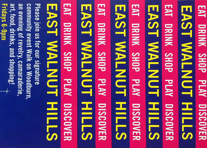
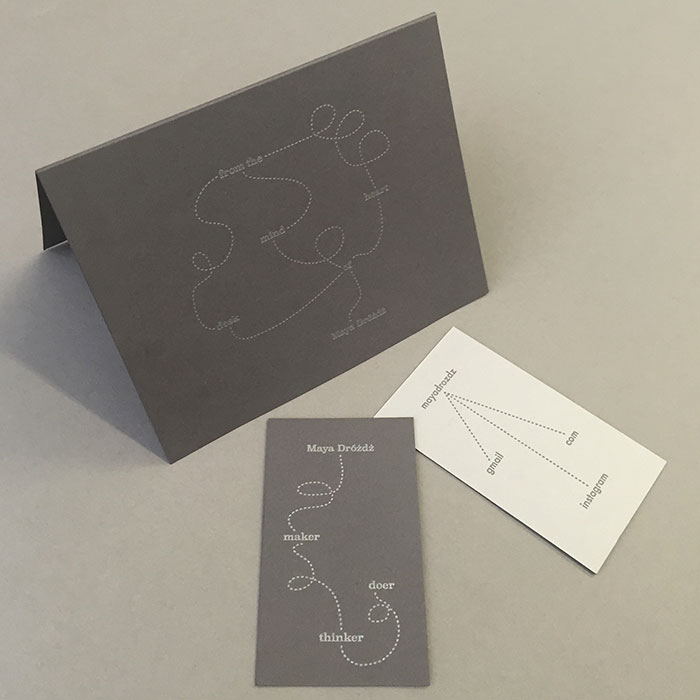
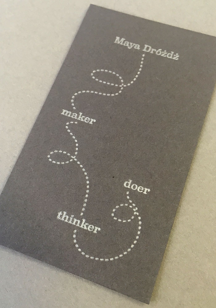
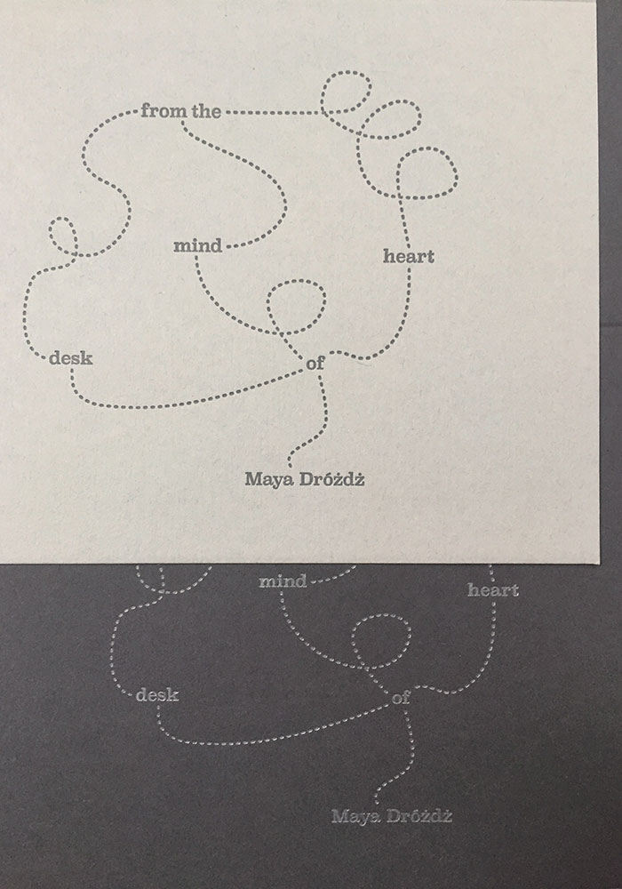
When I became a solo agent, I tasked myself to develop an identity that efficiently communicates a bit of my design thinking and finally capitalizes on the three diacritics in my monosyllabic last name. It’s clean, simple and, dare I say, smart.
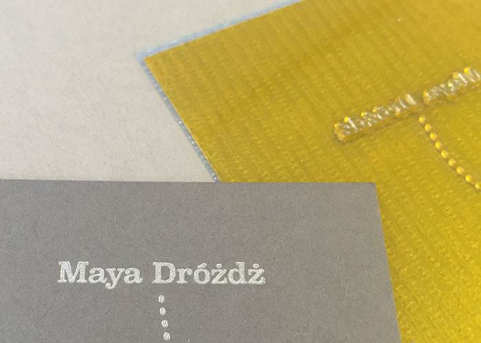
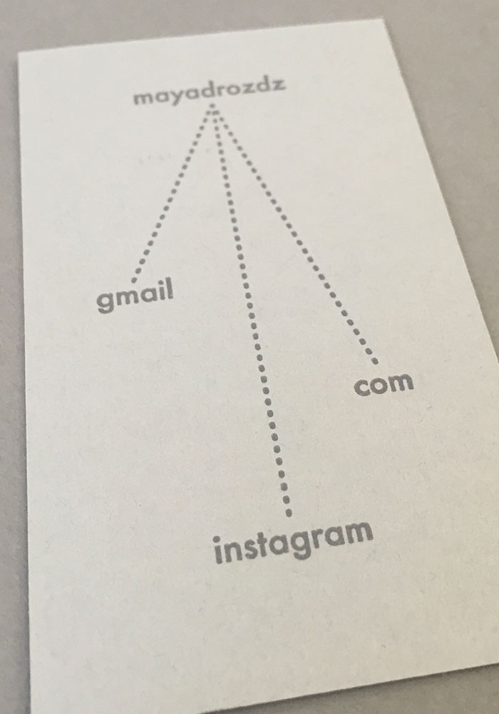
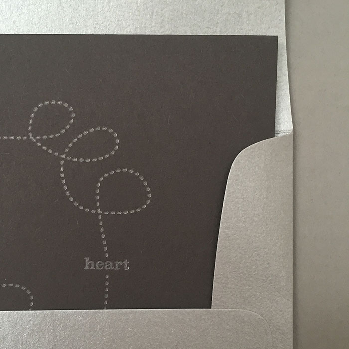
Two shades of grey cover weight paper were custom-duplexed for the business cards, with the silver and grey letterpress inks perfectly matched to the opposite paper colors. Leftover paper was used to print slightly sassy notecards which are mailed in silver envelopes.
concept and design: Maya Drozdz
duplexing and letterpress printing: Pistachio Press


